BY FreeWebStock
May 08, 2025In the ever-evolving world of web design, trends come and go—but few are as polarizing as brutalism. Rough around the edges, stubborn as steel, and unapologetically raw, brutalist web design strips away the fluff and embraces function over form. Unlike the sleek, polished aesthetics of minimalism, brutalism thrives on stark simplicity, exposed UI elements, and an almost industrial honesty.
But why is this trend resurfacing now? And is it the right choice for your website? Whether you're a designer looking to push boundaries or a brand aiming to disrupt the status quo, understanding brutalism is key. In this deep dive, we’ll explore its origins, characteristics, and how modern neo-brutalism is reinventing the trend for today’s digital landscape.
For those seeking inspiration, platforms like FreeWebStock offer a treasure trove of design assets to experiment with this bold style.
What is Brutalist Web Design?
Brutalist web design is raw, unrefined, and purpose-driven. It rejects decorative elements in favor of pure functionality—think monospaced fonts, stark backgrounds, and hyperlinks in their default blue. The philosophy is simple: content over aesthetics. This style isn’t about winning beauty contests; it’s about delivering information fast. Brutalist websites load quickly, prioritize readability, and eliminate distractions. However, this approach isn’t for everyone. While it works brilliantly for portfolios, experimental art sites, and disruptive brands, e-commerce stores or corporate websites might find it too abrasive.
Brutalism vs. Minimalism: A Stark Contrast
At first glance, brutalism and minimalism might seem similar—both favor simplicity. But where minimalism is polished and elegant, brutalism is bold and unapologetic.
- Minimalism uses whitespace, subtle typography, and refined visuals to create harmony.
- Brutalism embraces raw textures, exposed grids, and a "no-frills" attitude. For example, while a minimalist site might use delicate animations, a brutalist website would display raw HTML tables and unstyled buttons. The difference? Brutalism doesn’t care if you like it—it just wants to work.
A Brief History: From Concrete to Code
Brutalism didn’t start on the web—it began in 1950s architecture. Post-WWII Europe needed fast, affordable housing, leading to massive concrete structures that prioritized function over beauty. Buildings like London’s Hayward Gallery and New York’s Whitney Museum became icons of this movement.
Similarly, brutalist web design emerged as a reaction to overly flashy, bloated websites. Early examples like Craigslist and the Drudge Report proved that raw functionality could outperform glossy designs. Today, brutalism is making a comeback as designers rebel against cookie-cutter templates.
Neo-Brutalism: The Modern Reviva
Pure brutalism can feel too harsh for modern audiences—enter neo-brutalism. This updated version keeps the raw, functional core but injects personality through:
- Bold, saturated colors (think neon pinks and electric blues)
- Heavy drop shadows and outlined buttons
- Unfiltered, high-contrast imagery
- Playful typography with exaggerated sizing Brands like Balenciaga and Studio Job use neo-brutalism to stand out while maintaining usability. It’s the perfect middle ground for creatives who want an edge without alienating users.
Key Features of Brutalist & Neo-Brutalist Design
1. Color: Loud and Unfiltered
Brutalist sites often stick to monochrome or high-contrast palettes. Neo-brutalism amps this up with vibrant, saturated hues—yellows, magentas, and deep purples dominate. Gradients are rare; instead, flat, unblended colors make a statement.
2. Visuals: Raw and Unpolished
Forget airbrushed photos—brutalism embraces grainy, unfiltered images. Exposed UI elements (like visible borders and unstyled forms) reinforce the "what you see is what you get" ethos.
3. Typography: Bold and Unrefined
Giant, screen-filling headlines are a hallmark. Sans-serif fonts dominate, often with uneven spacing and experimental layouts to create visual tension.
When Should You Use Brutalism?
Brutalism isn’t for everyone, but it shines in these scenarios:
- 1. Creative portfolios (artists, designers, photographers)
- 2. Disruptive brands (streetwear, avant-garde fashion)
- 3. Experimental projects (digital art, indie publications) If your audience values authenticity over polish, brutalism could be your secret weapon.
Final Thoughts: Is Brutalism Here to Stay?
Like its architectural predecessor, brutalist web design is love-it-or-hate-it. While it may never dominate mainstream design, its influence is undeniable. For those tired of safe, predictable layouts, brutalism offers a thrilling alternative.
Ready to experiment? Try FreeWebStock for bold design assets and start crafting a website that breaks the mold. Whether you go full brutalist or opt for a neo-brutalist twist, one thing’s certain: this trend refuses to be ignored.
Design
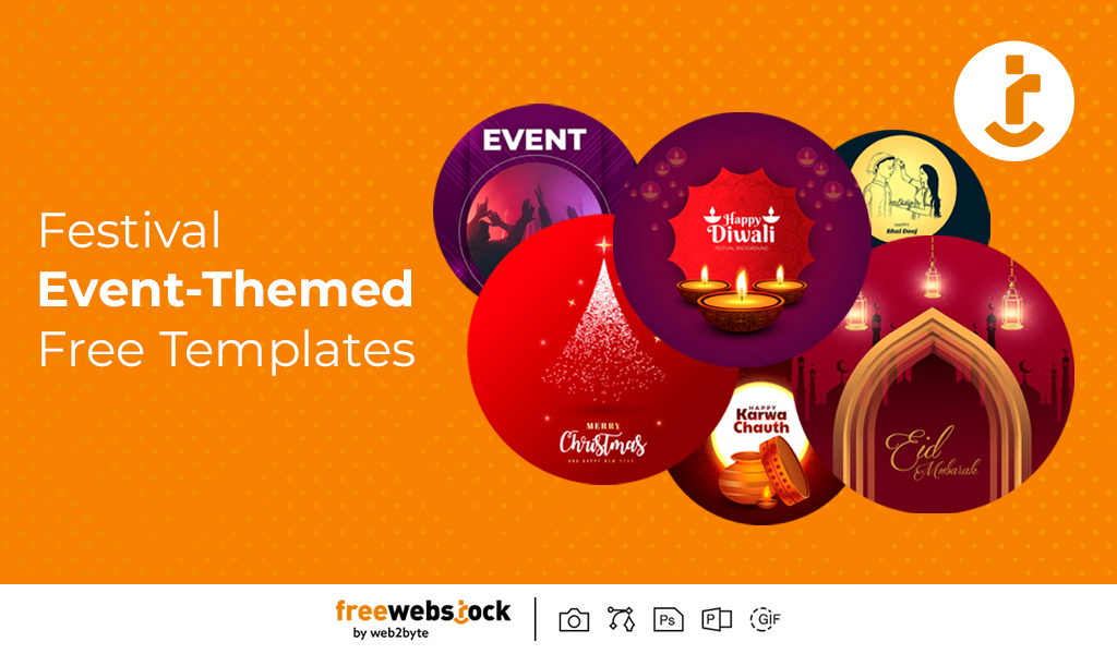
Festival & Event-Themed Free Templates: Elevate Your Celebrations with Ease
BY FreeWebStock
October 08, 2025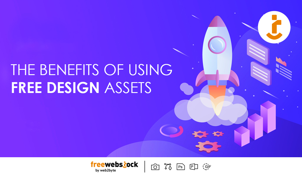
Design
The Benefits of Using Free Design Assets for Startups and Small Businesses
BY FreeWebStock
October 03, 2025
Design
Best Free Stock Imagery for Remote-Work Blogs, Social Media, and Websites
BY FreeWebStock
September 24, 2025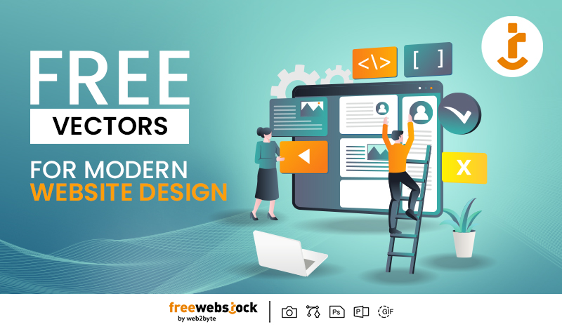

Design
Content Creators’ Secret: How to Go Viral with Free Design Resources
BY FreeWebStock
August 30, 2025
Design
Free Digital Marketing Templates for Small Businesses in 2025
BY FreeWebStock
August 26, 2025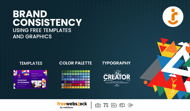
Design
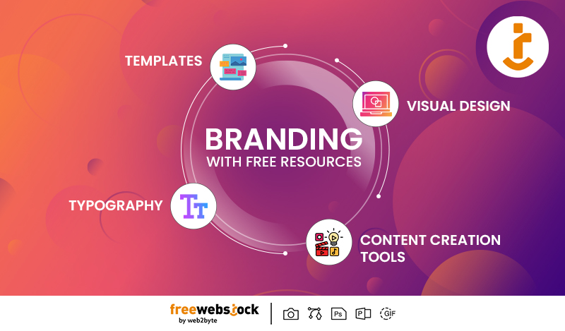
How to Maintain Brand Consistency Using Free Templates and Graphics
BY FreeWebStock
August 14, 2025
Design
How Marketers Can Use Free Design Assets to Level Up Campaigns
BY FreeWebStock
August 07, 2025